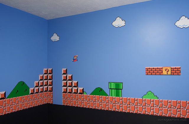
Believe it or not, the past will always inspire the future. Whatever type of computer you have at home now is better than what most businesses had back in the 80s. Twenty years ago, creativity and abstraction were not considered design choices, but they were the result of technological limitations put to good use. We all remember the famous Mario game, and not just because of the character who had bib overalls and a moustache, but also because of the creative landscape that was practical enough to make us love the game.
NES games revolutionized video gaming. The system created cultural imprints that continued to swell for decades, and it’s not going anywhere. The mere sound of grabbing as many coins as possible in Super Mario still sounds familiar to the 80s generation. Nowadays, people are talking about eye-popping and eye-candy effects and most design tools are becoming increasingly more complex. Each game that hits the market must push the limit in order to draw attention, especially since gamers are currently strained by tech features while the design and art of the game is misplaced through the pixels.
Simplicity is bliss
Mario’s famous designer Shigeru Miyamoto didn’t make the character to look good or entice the player in any way. He gave him a hat because it was simpler to animate than hair. Also, he had to do something to make Mario stand out from that striking background. Nowadays, the simplest, most inexpensive PC on the market is a graphical source of power. As opposite to the millions of color combos a modern computer can display, a NES (Nintendo Entertainment System) featured a hard-wired color palette of 48 colors. Together with a 256 by 240 resolution, as well as 2 kb of memory, most NES games had strict graphic limitations.
In order to create a virtual world, designers had at their disposal 1 background colour, 25 colours/scanline, 4 tiles set/ 3 colors each to build the background, and 4 tiles/3 colors to make the enemy. Within these apparently impossible limitations, the public grew quite fond of the games like Tetris, Army Games 365 and Final Fantasy.
Lack of color creates an ambiance
Metroid for example, was a science-fiction adventure game made by Nintendo back in 1986. The series was famous for its intimidating, creepy alien flick feel. Just like with most good horror movies, what we can’t see is a lot scarier than what we can actually see. Sparingly placed enemies, rooms linked to bubble doors, and players who had no idea what was coming next, made Metroid extremely enticing. The absence of color was managing to create an atmosphere, thus making the game intriguing and mysterious. That black background was meant to highlight the theme of the game: a world of darkness.
Complimenting the creative usage of tile placement and cave-like environments creates a natural landscape with valleys and peaks resembling the real world, which is far from being perfect and flat. Back in 1986, the approach was revolutionary, not to mention that the organic and grid-like structures were an inspiration to the modern world.
Creating an unbelievable world
Although most individuals are realistic, being a dreamer sometimes pays off too. In the video game Super Mario Brothers 2, the main characters and his pals are travelling through a world of dreams known as Subcon. Together with materializing door potions as well as veggies with cute smiley faces on them made the game quite surreal. Somehow, turtles and mushrooms conquering the world under the close supervision of an evil dragon make a lot of sense.
Is the power-up working?
Similar to a foaming cleanser forfeited on a late-night commercial by the most detestable pitchman, Megaman 3 and numerous others NES games are changing the characters’ color or alter their appearance to point out that a super-power is in place. When making use of a Robot Master weapon, Megaman changes colour; in the Mario game, the character’s size grows after eating a mushroom.
We can often witness such behaviour on the web, when we click on hyperlinks and they change color. Similar to a NES designer, it is important to develop something that can stand out from the crowd. A more current example is the Burn studios audio tool that imitates an implicit studio environment in Flash. Audiotool makes use of virtual cables to point out how items are linked and visually routed, rather than use confusing diagrams and menus. It’s up to the designer to find a way to show that a power-up is being put to use.
Never reveal what’s friendly and what’s not
Do you remember the first time you played Mario? When that mushroom came out didn’t you wonder if it’s friendly or not? What if it’s bad? What if it kills me? The overall design of a game must be innate. Mushrooms are almost impossible to miss in Mario, at least that first one from the beginning, so you immediately see it’s good. Yet, that carnivore plant that looks rather creepy doesn’t seem that tasty, so our perception tells us to avoid it. That’s how you play a game like Mario; you listen to your instincts.
Try not to fall into a trap and make an attempt to be different. In the end, you’ll make things worse and your design abilities won’t be explored to their highest potential. Wonderful things to have are knowledge, skill, and tools, yet they’re not sure-fire means to victory either.
Photo Credit: Flickr/Casey Fleser


