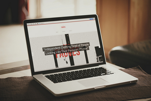
Have you ever stumbled across a random website, and before you even realized what you were doing, found yourself four clicks deep in the site, signing up or buying something you’d never heard of before? That’s the power of good design. In the digital age, website design is like the sails of a ship – a great design will take you anywhere you want to go, while a bad design will leave you stranded in the metaphorical harbor.
This year marks the first that digital media has surpassed older, traditional media forms – radio, television, and print – in viewing by U.S. adults. As the predominance of digital media grows, so does the importance of utilizing effective design methods. Whatever the goals of your web traffic may be – (generating sales leads, spreading the word about a product or service, signing up new users for a social media service, etc.) – they will benefit from following some basic principles that maximize not only a user’s time spent on a page, but how effectively that time is used. Here are 7 essential elements to keep in mind whenever designing a new site, or sprucing up an old one.
No superlatives
How many “best burger in the city?” signs have you seen in your life? Probably dozens. And how many times has that phrase ever inspired you to eat at, or even consider eating at, the restaurant making the ridiculous claim? Probably none. Superlatives should be avoided like the plague on your site for two simple reasons – they bore people and turn them off, quickly losing their attention, and they waste space that could otherwise be used to make a compelling argument.
Instead of a throwaway phrase like “best computer repair in (insert city)” write something with a good value proposition, like “we’ve fixed over 10,000 computers since 2003” or “repairs are guaranteed to be finished in 24 hours.” Ditch the superlatives in favor of a clear, engaging message.
Visual hierarchy
As countless studies have taught us, first impressions do, in fact, matter. This is especially relevant in design considering the short amount of time a person spends on a new, unknown website. Since a person will be forming an opinion in the first few seconds of visiting a site, the first things they see on the page should be the most important.
The key is to prioritize page elements based on your business objective. Do you want to sign up new users to your email list? Place the field for them to sign up front and center on page 1. Trying to push a certain product? Don’t hide it 3 clicks in halfway down a page – have a large image of it be the first thing you see when you land on the site. Everything should be placed on the page in the order you want the user to see it.
Negative space
Go to Google’s home page. What stands out? Obviously, the search bar, since besides the Google logo, it’s nearly the only other thing on the page. This is an excellent (if somewhat extreme) example of the power of negative space. Using negative space effectively is a great way to draw attention to anything it surrounds. This can be particularly useful in product photos and logos. The less cluttered your page is, the more a user will be able focus on the important stuff – which is the point, right?
Aid decision making
The point of these design elements is to get a user on your site to make a choice – whether it be to buy a particular product, simply to share the page through social media, or to sign up for a lifetime membership. To that end, anything you can do to aid in decision making will help you achieve your goals. The thing to remember here is not to overload a user with choices – studies have shown that anything past 3 choices imposes a task on the reader they may not be willing to take up. For products, place them to heighten their contrast – if you have two white shirts and one black shirt, place the black shirt in the middle for emphasis.
One action per screen
Once you have a user’s attention, do something with it! Have the choice you want the user to make (usually clicking a button to redirect to another page, subscribe, learn more info, etc.) the focal point of your first page – and don’t add any other actions to that page. Sure, it may seem like a good idea to have your email list, product order form, contact information and other information all upfront, but in reality, all it does is confuse the user and draw them away from the primary objective of your site.
Airbnb.com is a great example of this. On their home page, an objective is listed large and bold: Find a place to stay. Underneath, a user is prompted to enter where they want to go and for how long, followed by a large search button. Within seconds of landing on the site, the user has already completed the objective of the site – searching for temporary housing. Simple and effective.
Put information in a footer
Of course, all of the secondary information on your site has to go somewhere. Placing a sitemap, contact information and other important details in a clear, easy to scan footer at the bottom of the page is highly effective for a few reasons. A footer keeps all the information well-organized in one spot, as opposed to scattered around the page. It allows for optimization of the top of the page (see the principles above.) As this design principle is generally the norm, this is often where users will instinctively look for additional information. Finally, a good footer “closes” the page visually and gives it a completed, finished look.
Clear about us and contact
If all of these principles had to be condensed into one, it would be: clarity is key. You don’t want users to guess about what you do, who you are, or how to contact you. Be clear, be concise, and be creative. The web is full of boring, lifeless about us pages featuring such yawn-inducing cliches as “specializing in applied business solutions” or “providing a great customer service experience.” Explain, in simple, conversational terms, what you do and why the user should care.
Here is the first line of the National Geographic about us page: “The National Geographic Society has been inspiring people to care about the planet since 1888.” There are only two additional sentences following that one. Clear and simple – notice a trend here? You want users to leave your page knowing who you are, and interested enough to remember you.
There are a shocking amount of badly designed sites out there – even among large, successful companies. A great design puts you ahead of the curve when competing for a user’s online attention. The design principles outlined above will help you create rich, engaging pages that draw users in and help your site achieve its goals, whether they are total world domination for your products or simply getting users to sign up for your mailing list.
Photo Credit: Flickr/Anatasof Wirapraja


