


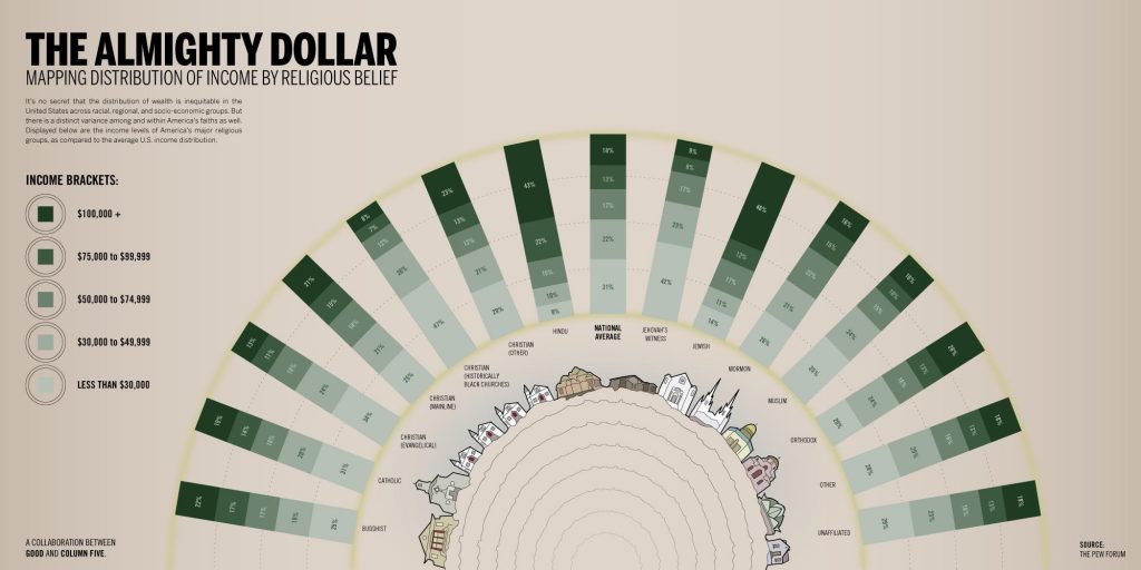
Now every once in a while, we come across an info graphic that is just pure gold – this is one of them. now just because it its content, but because it is something that you will never ask yourself but when it presents itself to you, there is a AHA! Moment in your head. This infographic is a representation of how religious groups and income overlap or seem to overlap. While finding a fair share of wealthy people in one community and religion is a pretty normal thing, but when put in statistic, you will find that there is a skewed figure, with the Hindu and the Jewish community that have a higher average income than the national average. The info graphic also has other fun figures which really give an insight into this co relation.


